Group 1: Bridge to Calculus
James D'Elia, Tehani Cabour, McKenna Quam
ISEC Bridge, Northeastern University
ISEC Bridge, Northeastern University
Seeing the long-lasting effects discrepancies in public education have on the overarching racial and social issues of a city, Dr. Case decided to found Bridge to Calculus (BTC), a program which prepares students from underserved high schools in Boston for AP Calculus. Prior to BTC, this key AP course was not offered at most underserved schools due to lack of demand and training, putting the affected students at an early disadvantage. By collaborating with the students’ high school teachers, BTC supplies existing education systems with resources and know-how, thereby building a self-sustaining model. This goes beyond empowering the directly participating students, as it gives the school systems themselves the ability to push against the existent inequality. For the program to persist in its growth, it requires an increase in funding and participating students. We are collaborating with Professor Veetel to deliver data visualizations with the intent of 1) convincing program funders and 2) encouraging local schools to promote the program to students’ parents. We have been supplied with data on attending student demographics (gender/ethnicity/age) as well as student performances and behaviors both pre- and post-program. While all stakeholders need to understand the student performance data, funders would additionally require information on demographic distributions.
The data that we were provided from Bridge to Calculus came in two parts. We were given access to a Power BI portal that contained interactive summary statistics for each session of Bridge to Calculus starting in 2017 and the survey results from the 3 surveys taken in the summer 2022 session of Bridge to Calculus. Those three surveys were the SAYO-S which is a student self survey on their skills before the program, the SAYO-T which is the teacher survey of how the students performed pre and post the program and the HSA which is a student taken survey pre- and post- the program that also records demographics information about the students. These assessments are provided by the organization Boston After School & Beyond. The terms of Bridge to Calculus themselves are ordinal data, as there are discrete terms that are in a temporal order. The gender and ethnicity of students is categorical, and the number of students attended and the percentage in attendance are quantitative. The test scores from the SAYO-T are ordinal as they represent answers to questions using the likert scale (never, rarely, sometimes, often, always) however their averages are quantitative.
Our first domain task was to chart the difference in the demographic information over the time the program has been running. In order to do this, we will have to find the data from the Power BI portal. The HSA does have demographic information but we only have the HSA from summer 2022 which only has 13 entries, meaning we must take the data from the portal, which will have less detail, but it will serve the task better. We also wanted to chart the total attendance of the program over time which was easy to find in the portal as it gave us both the percentages and the number of students in the program. Our second domain task was to show student growth within a session. In an ideal world, we would be able to get access to the scores from these students' AP test scores because that is the data that is most valuable to schools, as it is standardized for all students across the country. However, College Board will not give that data out. In order to showcase the students’ improvement, we used the SAYO-T from the summer 2022 session to show growth. This was because the HSA and the SAYO-S only showed the scores after completing the program, so they are not useful in trying to show growth.
As mentioned above the demographic statistics from the Power BI portal were summary statistics for each session of the program that were given in percentages. For each session, we recorded the total number of students and the percent of each gender and ethnicity. From that, we calculated how many students of each gender/race were at each session. Because gender and ethnicity were separately recorded on the portal that means we know how many females there were for a given session and how many Asian people were at a given session but not how many Asian females there were at a given session, for example. We need to keep that in mind when creating visualizations, as this means we cannot correlate the 2 of them in the same chart. Similarly there was a lot of data in the SAYO-T that we did not need. For the survey there are 5 questions that are asked for each category of test (Adults, Communication, Math, ect.) but plotting all of those would cause too much clutter in the graph, instead it is better to just take the averages for each category. As well a pre score without a post score does not allow us to show improvement so those were removed from the data set. Finally, it should be noted that, due to COVID-19, Bridge to Calculus did not run a summer program in 2020. Depending on the visualization we may choose to omit summer 2020 entirely or find a way to visually represent its absence. There were some sessions of Bridge to Calculus which ran during the school year as well, however those are not relevant to our study of the summer program so they will be excluded from our analysis.
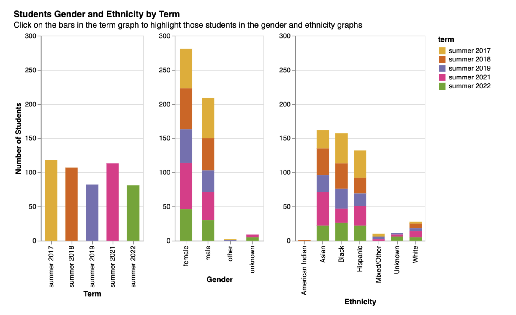
This chart represents the demographic distribution of students in the program over the different terms. When a user clicks on a bar in the term graph it will filter the data in the other 2 graphs so that the students from that term are shown. I choose a categorical color scheme for the terms as even though the terms have a sequential order using an ordinal color scheme might give the user the impression that one year is better or bigger than another. As well this graph has a fixed y axis going from 0-300 on each graph so it is easier to read them side by side. This means there only needs to be one y axis label as all of the y axes are measuring the same thing. However I did keep the tick labels on each graph for readability.
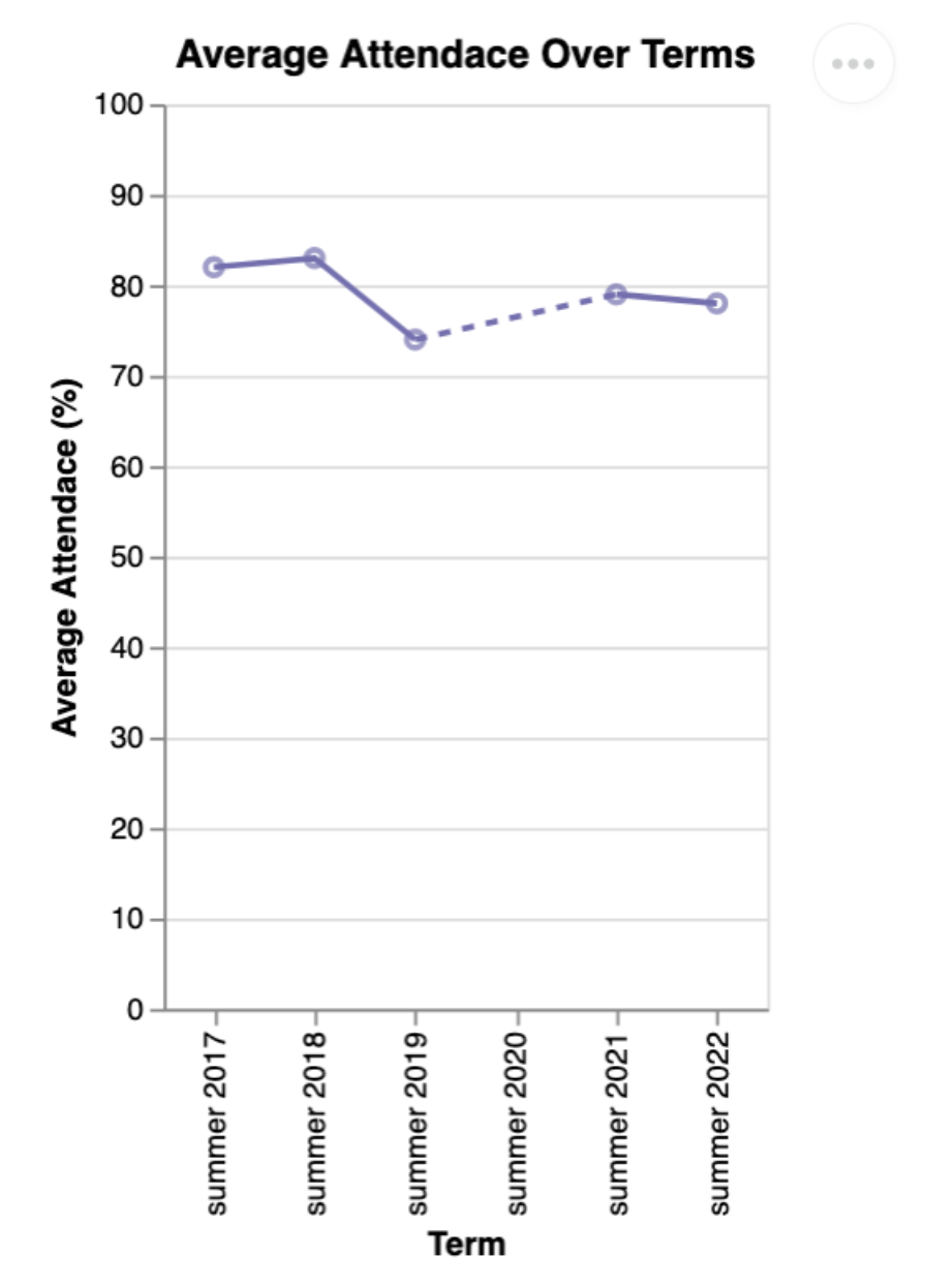
This next graph is a simple chart showing the attendance percentage over the 5 summer terms that Bridge to Calculus has been running. There is a dashed line to represent a lack of a term in Summer 2020. The dashed line also helps to communicate that BtC’s attendance average improved post pandemic and that they have come back stronger. I added points to the line chart to help emphasize that there was not a term in 2020 as it doesn't have a point. As well I will use these points to add a tooltip that will show what the exact number of attendance was as well as the total amount of students that term. I have the y axis set to the values 0-100 as that is the maximum and minimum values of a percentage. This reduces the lie factor of the chart by showing the data over the range of possible values, and because BtC has impressive attendance numbers it emphasizes that by having a significant amount of white space beneath the line.
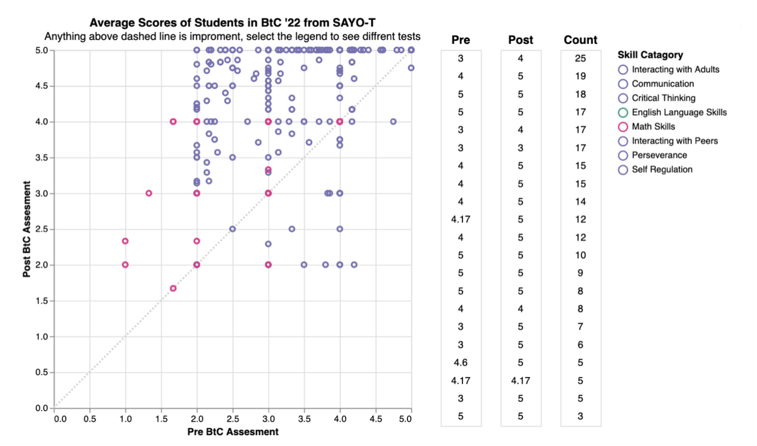
This visualization represents the assessment scores from the SAYO-T from the summer 2022 term of BtC. The SAYO-T is the teacher assessment of students before and after the program. The teachers are asked 5 questions about each student in each of the skill categories and then those scores are averaged to get the average for each skill. This means that while the data is technically quantitative, there is high concentration around certain whole number values. Therefore I chose to represent this data as a scatter graph with an accompanying table to show how many values are occupying the same space. This graph will filter on the legend allowing the user to see the values for each category, both the table and the graph will filter. The skills are also color encoded, with the “soft” skills coded in purple, math being encoded in pink, and English encoded in green. This is because there are too many skills to encode each of them separately and therefore encoding them as categories reads better while still allowing the user to highlight the legend to see specific skills. Finally I added a dashed gray line to show which points showed student improvement, this also allows the user to see that there are many more points of improvement than disimprovement.
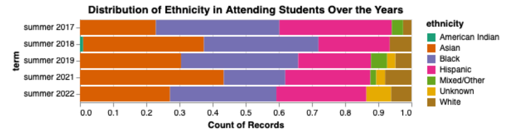
This visualization demonstrates the distribution of attending students’ ethnicities over the years, prioritizing our first task of presenting a shift in demographic distribution. At a quick glance, it is apparent from this visualization that, over the years, Asian, Black, and Hispanic backgrounds represent a clear majority of the student body. The distribution constantly shifts, but maintains a pretty consistent majority of students with backgrounds typically considered minorities. This piece of information is especially interesting to potential donors/investors, as it demonstrates that BTC is indeed primarily working with otherwise underrepresented groups. I have created a normalized stacked bar chart presenting the distribution of students’ ethnicities over the years. The y-axis represents the percentage of attending students, and the x-axis the year that the program occurred in. Because ethnicity is categorical data, I used color as the channel encoding the data. As for the quantitative data, year is demonstrated using position, and percentage of attending students is represented using length. I used lines as marks as the dataset is relatively small, but there were a handful of ethnicities to represent, so a stacked bar chart made the clearest visualization. Normalizing the bars made it easier to focus on the demographic distribution, rather than number of students attending.
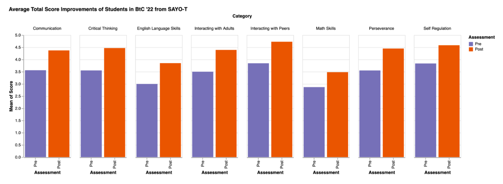
This is another visualization that applies to student performance on assessments. However, this one places a greater emphasis on how well the students performed on average for each respective category. I felt that a grouped bar chart would most clearly represent the difference in averages between 2 different assessments which focus on multiple categories. The test scores are grouped by category, with the math and ELA scores being combined over multiple categories. It is clear to see that, on average for all assessments, the students improved their skills.
First Visualization
This stacked bar graph shows the breakdown of students by gender and ethnicity for each summer term of Bridge to Calculus. If you click on the bars of the first graph it will filter the other graphs to allow for comparison of each term.
Second Visualization
This normalized bar chart demonstrates the distribution of ethnicity in attending students over the years.
Third Visualization
This is a line chart showing the percentage attendance for each summer term of Bridge to Calculus. There was no term offered in 2020 due to the pandemic so it is represented with a dashed line. There is a tooltip on each of the dots providing more detail about the attendance numbers.
Fourth Visualization
This is a scatter plot and linked table showing the pre and post scores of the SAYO-T which is a survey that is given to the instructors of Bridge to Calculus to track student improvement across several skill categories (both hard and soft). Click on the legend to filter by the skill assed. The table shows the counts of students at that score. In addition there is a gray dashed to allow the viewer to clearly see which marks represent improvement.
Fifth Visualization
This grouped bar chart represents the difference in averages between 2 different assessments which focus on multiple categories. It demonstrates how well the students performed on average for each respective category.
From our exploring of the data through visualizations, we found that the ethnicities that Bridge to Calculus are most heavily serving are Asian, Black, and Hispanic and that BtC serves more woman than men. This is significant as women of color are often discouraged from pursuing STEM fields and therefore are the group that would most benefit from BtC’s mission of giving students the tools they need to pursue calculus and therefore higher education in a math or science field.
Our visualizations also show that Bridge to Calculus’ program effectively improves students' academic and personal skills. From the 22’ SAYO-T averages graph, students improved in every area the survey covered, and from the SAYO-T scatterplot, we can see that students specifically improved drastically when it came to interacting with their peers. These summer sessions are not only improving student mathematics but also their ability to be contributing members of their communities. As well these sessions are well attended, after the covid pandemic, BtC saw an increase in their average attendance for the session.
These visualizations show that Bridge to Calculus is supporting underserved communities efficiently and consistently in its mission to help students become better mathmaticians and devolope into successful young adults.