James D'Elia A5/A7 Website
Data Overview
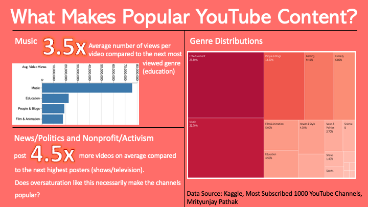
For this assignment, I chose to analyze a dataset containing the top 1000 most subscribed to YouTubers and their video count, view count, and category. This is a dataset that was compiled and posted to Kaggle.com (https://www.kaggle.com/datasets/themrityunjaypathak /most-subscribed-1000-youtube-channels). I chose to use this dataset because I am a frequent YouTube user and I am curious to see what is generally the most popular type of content across the site. It would also be interesting to see if there are any parts of YouTube that are extremely popular that I am unfamiliar with; these could be interesting to explore and find out what makes them so popular. It is also very possible that the sections of YouTube I typically enjoy may not be as popular as I perceive them to be because it is very easy to get trapped in one section of YouTube. When looking at this dataset, I noticed that YouTube-created channels are included but do not have stats on video or view count. To make the analysis centered around creators and artists and also to improve its accuracy, these channels will be filtered out. In order to provide an accurate comparison across genres, I chose to create a new column for the average views per video for each channel. Using this, it is easier to see which channels are consistently popular as channels with a high view count per video will more than likely be popular. From the initial exploration using Tableau, it was very apparent that the music category is the most popular, but this is the case because music and music videos receive many more replays compared to other content creators. Therefore, it is key to analyze music content separately from other types of content. Otherwise, education, films/animation, and blogs appear to be the most popular categories. Another key feature to check to analyze popularity is video count. Channels with high video counts on average will gain significant amounts of subscribers because of the variety of content they cover. Therefore, their subscriber count makes their popularity appear greater than it actually is. There are 2 categories with extremely high average video count values: nonprofits & activism and news. This makes sense as these categories of content tend to cover a variety of topics.
Data Visualization(s)
First Visualization
This visualization is an overlaid stripplot with jitter displaying the amount of videos for each channel with each data point colored by category. I chose a stripplot for this data because I only wanted to show video count and there are too many channels for a bar plot. Overlaying all categories onto one plot condenses the information, allows for more customization of the visualization, and makes it easier to compare across categories. I decided to use color to encode the data on this plot because I wanted to highlight differences between different categories, and having different colors for the categories is the easiest way to distinguish between them. I chose to make this visualization interactive as the data points are small and zooming in would be quite useful considering some of the massive outliers in the graph. I also added a filter based on category which displays only the data points for a specific category when it is clicked on in the legend. This makes it easier to determine the distributions for each category, and thus makes it easier to compare the distributions across categories. I also added a tooltip including the channel name and their subscriber rank to allow for more analysis into why a channel is ranked at the position they are. By using the filter, it is clear to see that the news and nonprofit & activism categories have the largest distribution meaning that many of these types of channels upload massive amounts of videos compared to other types. This means that a possible reason their subscriber count is so high is because of the sheer number of videos they upload. We also see that many music channels have a low video count meaning that most of the views music channels get are repeat viewers.
Second Visualization
This visualization is a sorted bar chart of the average number of views per video for each category of YouTube channels for the top 1000 most subscribed channels. I chose a simpler visualization to display this information because it was the clearest way to show the types ofchannels getting the most views. This graph also has a tooltip when clicking on each bar showing the average total views and the average ranking for each channel. Looking at this chart, it is clear that music gets the most average views per video by a massive margin, but this is due to the replay value of music. Besides music, the most popular types of channels are education, blogs, and film/animation, by this metric.
Infographic
In my infographic, I want to display to the viewer what genres of content creators on YouTube are the most popular and provide some insight into why that is. YouTube is a very large website with much variety in content, and I believe it would be interesting to break it down generally and analyze trends for popular creators. Using some of what I’ve done in A5, I want to include information about view count, video count, and genre distribution of YouTubers to analyze popularity among the top subscribed YouTube channels. With this information, I plan to show music as an extreme outlier with view counts, a correlation between high video counts and low video views, and which genres are the most represented in the dataset. By showcasing these, I intend to show why music is an outlier, why some accounts seem more popular than they may actually be, and overall why certain genres are more appealing to large audiences.